

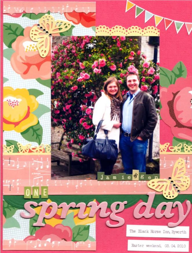
 Just a quick, colourful layout to share with you on this dreary Sunday! I was really inspired by Stephanie Howell's Studio Calico challenge on National Scrapbook Day...to Scrap your Opposite. As a general rule, I like to use neutral cardstock (white, vanilla, grey, kraft etc.) with just a few embellishments (usually punches). I tend to avoid bright, vivid colours...and even though I LOVE the layered, distressed look on layouts, I find it difficult to recreate myself.
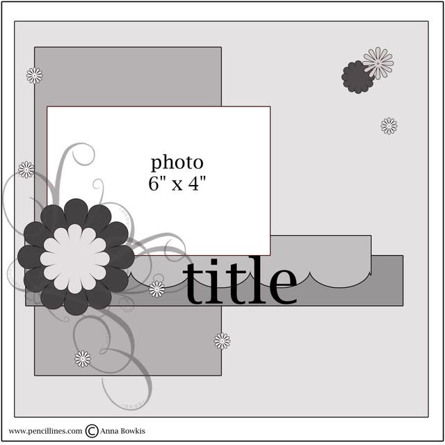
Sooooo, I decided to use some Dear Lizzy patterned papers against a nice, bold background (American Craft cardstock in Grapefruit). I based the overall layout on Sketch 183 from Pencil Lines...
 ....and pretty much went from there. I did my best to 'scrap outside the box,' with varying degrees of success (I ended up pulling everything off the page and starting over). I don't really have much in the way of co-ordinating embellishments in my stash, so I used several different punches to accent the page, along with a couple of cut-outs from the Dear Lizzy papers. Can you tell that I have a bit of a thing for butterflies at the moment?! Love, LOVE the Martha Stewart Large Double Butterfly punch and her Monarch Butterfly Edge punch. I also used my brand new Tim Holtz Tiny Attacher, which was on sale at Craft Obsessions. Those staples really are tiny!
So, does colour scare you too? Do you like lots of white space or do you like to layer different elements on your layouts? I'd love to know!
Happy Sunday!


2 comments:
Gorgeous layout!! And I've been away from the computer for a few days, so I'm not sure exactly when you made the change but the new look is awesome!! Everything is so bright and easy to read. Love the link to your P365 and your new header!
LOVE this layout! It is so bright and cheery! You did a great job on your blog as well!
Post a Comment